Story of the USA Games Logo
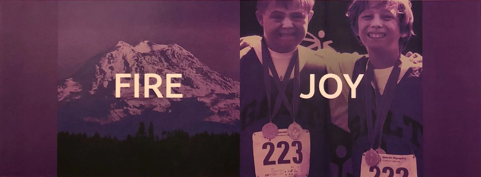
The mark for the 2018 Special Olympics USA Games is inspired by the iconic torch, the water around Seattle, as well as the sweat and tears of joy of the athletes, volunteers, families, and fans.
The colors are representative of the water and landscape of the Pacific Northwest. The fluid movement of the overall shape shows athleticism and energy. Many layers overlap, rising upward and working together, to show unity inspired by the games.
Created by Publicis, together we challenge ourselves and the world to redefine labels and celebrate what makes us all unique. To not just meet expectations, but to go beyond them. Not just every 4 years, but every day, in every city, every state and every continent. Together we challenge the world to truly live and play unified. Rise with us.


